CSS games: discover the power of CSS3 animations
Cyrille Jouineau6 min read
The development of CSS3 and its improving support in “modern” browsers brought us crazy JavaScript-free animations featuring gradients, rotations, 3D and way too many iStuff.
These visual experiments are certainly nice but I started searching for ways of adding interactivity to go one step further and make games using only CSS.
This is precisely when I stumbled upon Alex Walker’s CSS3 Pong demo.
It may not be a real game but let’s be clear: if it’s a game you want to make, do not use CSS. However, if you want to play with CSS and share the fun, it’s ok!
So now we’ll talk about the first (more incoming) game I made: Click Invaders.
Pseudo-classes as Events
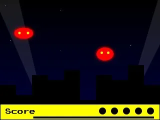
For a first game I kept it simple and went for a basic mouse shooter.
In Click Invaders, you click an enemy to kill it.
The click event is easy to capture with JavaScript but not with a decoration language like CSS. Instead we’ll use the :checked pseudo-class and style the normal and checked states of an input, here a checkbox.
That’s right, in Click Invaders you are actually filling a form, not destroying monsters from outer space :D
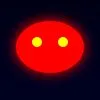
Since we can’t style checkboxes that much, the invader is going to be the label corresponding to the input via the for/id attributes.
HTML
CSS
/* the red bean body */ .invader label { display: block; width: 40px; height: 40px; line-height: 40px; padding: 10px; background: red; border-radius: 50%; box-shadow: 0 0 20px red; }
/* the eyes */ .invader label:before, .invader label:after { content: ”; display: block; position: absolute; top: 16px; width: 10px; height: 10px; background: yellow; border-radius: 50%; } .invader label:before {left: 16px;} .invader label:after {right: 16px;}
/* the input, hidden somewhere in a galaxy far away */ .invader input { position: absolute; top: -9999px; left: -9999px; }
When we click the label, it triggers and checks the input. And when the input is checked, we hide the label, hence the invader disappears.
/* R.I.P. */ .invader input:checked + label { display: none; }
Advanced selectors
Notice the use of the adjacent sibling combinator (+). Inputs don’t have children, therefore we can’t do something like:
/* impossible */ input:checked label { display: none; }
But we can’t target a parent tag either. So we need the label right after the input, on the same level, and use the + selector that does exactly this: target the next element.
So now we can make our enemies disappear. Not cool enough!
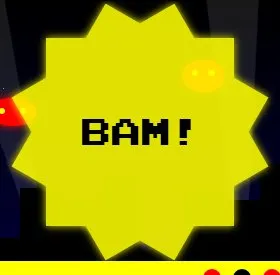
What we want is to blast the hell out of every invader we kill: let’s explode them!
The plan here is to hide the explosion and make it appear only after the kill (after the input is checked, that is).
HTML
CSS
/* explosions are twelve-point-stars from www.css3shapes.com */ .explosion .explosionBase { width: 300px; height: 300px; background: yellow; box-shadow: 0 0 20px yellow; position: absolute; }
.explosion:before, .explosion:after { width: 300px; height: 300px; background: yellow; box-shadow: 0 0 20px yellow; position: absolute; content: ""; } .explosion:before {transform: rotate(30deg);} .explosion:after {transform: rotate(-30deg);}
.explosion span { position: absolute; top: 130px; left: 0; z-index: 3; display: block; width: 300px; height: 300px; font-size: 48px; text-align: center; text-transform: uppercase; user-select: none; }
/* KABOOM baby */ .invader input:checked ~ .explosion { display: block; }
In essence, that’s exactly the same as we’ve seen before except we use the general sibling combinator (~).
It is a more powerful version of the + selector that can target any element positioned after the first element and at the same level.
In that regard, wrapping my invaders inside a div.invader was actually a bad idea since the more “flat” your HTML structure is, the more efficient your selectors will be.
Animations
That does look better but at this point we’re lacking something essential: those invaders, they need to fly!
Chances are that you are already familiar with CSS3 animations yet I think one important reminder is due: IE9 don’t handle them.
To be honest, I had initially planned to have a distinct flying animation for each invader (there are 5) but I got lazy so I settled for one zigzag animation and applied different delay and direction values:
CSS
.invader label { /* name, duration, iteration (same for all invaders) */ animation: fly 14s infinite; }
.invader.three label { /* specific delay and direction */ animation-delay: 3s; animation-direction: alternate, normal; }
/* position and deformation at different steps */ @keyframes fly { 0% { top: 0; left: -20%; padding: 0 20px; } 25% { top: 40px; left: 120%; padding: 10px; } 50% { top: 30%; left: -20%; padding: 0 20px; } 75% { top: 50%; left: 120%; padding: 10px; } 100% { top: 80%; left: -20%; padding: 0 20px; } }
To infinity and beyond!
Here we are, we have reached a point where we can actually say that we build a “game”.
Granted, it’s not a very interesting game but I warned you earlier^^
Click Invaders also features Start screen, a timer and more decorative elements such as stars, buildings and lights.
It can (and will) be largely improved using various CSS tricks though most of it should follow the following formula: pseudo-class + selector + animation.
Keep in mind that CSS3 is in constant evolution and so is its actual support in browsers so you’ll probably need to use prefixes (-webkit-, -moz-, -o-, -ms-) when implementing uncommon CSS3 properties.
To help you with that I advise you use prefixfree or a CSS preprocessor like LESS.
Other resources: Can I use…, Mozilla Developer Network.
Hopefully the things we’ve seen are not limited to CSS games. For instance, it can be used to replace some minor JavaScript effects just like I did in this very article with the “hover for more” blocks that use the :hover pseudo-class, or custom ON/OFF switches.
Thanks for reading, I’ll make sure to keep you updated!
