Dimensionality reduction for exploration and curation of datasets
Stepan Lebedev13 min read
The availability of AI models for everyday users skyrocketed last year, leading to a surge in Artificial Intelligence’s popularity. However, despite this advancement, companies still grapple with the challenge of collecting accurate data for AI implementation. Today, the significance of well-curated data has only grown, yet many companies struggle with this aspect. With databases expanding rapidly and containing numerous parameters, human analysis becomes exceedingly challenging, if not impossible. Let’s see how we simplify this task using a powerful projection algorithm!
Why clean data is important? Other approaches to get insights
Unrepresentative, poorly structured, or inadequately annotated data significantly contributes to the failure of AI projects. This is primarily due to machine learning’s sensitivity to outliers, including aberrant, false, or unrepresentative data. Additionally, the quality of responses from Large Language Models (LLMs) hinges on the quality of provided context. Therefore, employing specific tools for proper data curation is imperative.
We could cite this interesting approach using LLMs, but it requires to know things about prompt engineering and may struggle to scale. In this article, we try to tackle the problem in another way using a deterministic algorithm.
Indeed, a family of nonlinear dimensionality reduction techniques by simplifying the high dimensional representation of the data, allows getting valuable insights about how to improve the quality of our dataset. There are a lot of different algorithms (such as t-SNE, nonlinear PCA, Laplacian Eigenmaps, etc…) but we will concentrate on the one that gives the best results for visual analysis, UMAP.
What is UMAP (Uniform Manifold Approximation and Projection), a primer
UMAP (Uniform Manifold Approximation and Projection) is a dimensionality reduction technique that is widely used for visualizing high-dimensional data in a lower-dimensional space. It is particularly effective in preserving both the local and global structure of the data.
The UMAP algorithm works by constructing a graph representation of the data, where each datapoint is connected to its nearest neighbors. It then projects each datapoint into a low dimension in a way that preserves these local relationships. Using simple words, if two datapoints are close (with regard to some metric) in the high dimensional space, they will be close in the low dimensional space.
One of the key advantages of UMAP is its ability to handle large datasets efficiently. It scales well to millions of datapoints and can be applied to both numerical and categorical data. UMAP also offers various parameters that allow users to control the trade-off between preserving local and global structure, as well as the density of the resulting embedding.
In summary, UMAP is a powerful dimensionality reduction technique that can be used for exploratory data analysis, clustering, and visualization. It provides a flexible and efficient approach to reducing the dimensionality of complex datasets while preserving important structural information. In our case, we want to find aberrations and confusing datapoints by applying the minimum effort and assuming that we don’t know in depth the client’s domain nor are masters of sophisticated data analysis techniques. It seems that UMAP reducing data to 2D points is a good choice for our use case.
If you are interested in having more details about how UMAP works, feel free to visit the official website.
UMAP application examples
To get a grip on what type of visualization UMAP can provide, we will see in this section its application on a common
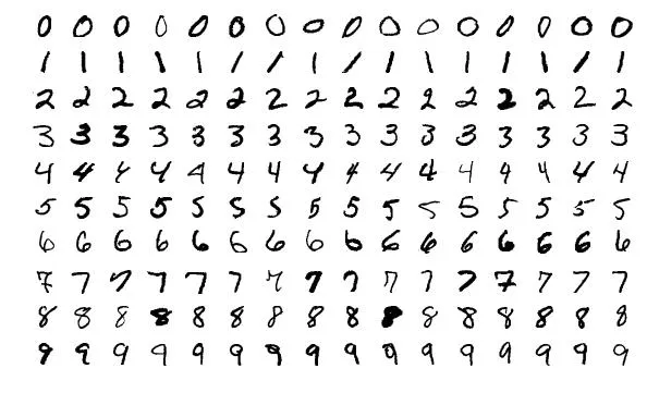
dataset: MNIST. MNIST is a dataset of handwritten digits, widely used as a benchmark in the field of machine learning.
It contains 60 000 train samples (6 000 images per digit) and 10 000 test samples (1 000 images per digit). Each image
is on the grayscale and is shaped 28x28. Here are some examples of what kind of images you expect to find:
With the next code snippet, we manage to plot UMAP output on the MNIST and color each projected datapoint according to the class it belongs to:
import matplotlib.pyplot as plt
from sklearn.datasets import fetch_openml
from umap import UMAP


# Load MNIST dataset
mnist = fetch_openml('mnist_784', version=1, cache=True)
X = mnist.data
y = mnist.target.astype(int)


# Apply UMAP
umap = UMAP(n_components=2)
X_umap = umap.fit_transform(X)


# Plot UMAP output with class colors
plt.scatter(X_umap[:, 0], X_umap[:, 1], c=y, cmap='tab10', s=1)
plt.colorbar()
plt.title('UMAP Visualization of MNIST')
plt.show()
We will then have the following representation:
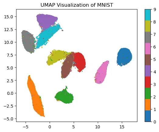
As you can see most of the elements are plotted close to other images from the same class. However, some of them seem to be plotting where they shouldn’t. If you keep track of the image associated with those datapoints you can easily find some annotation errors, difficult data and aberrations.
How to project real-world data with UMAP?
Raw data projection
The first example is easy to understand, but it does not represent the real-world situation. Indeed, it’s not likely that you will have such small images with no colors and a relatively low amount of information. In most cases, you will deal with large data vectors containing a lot of noise.
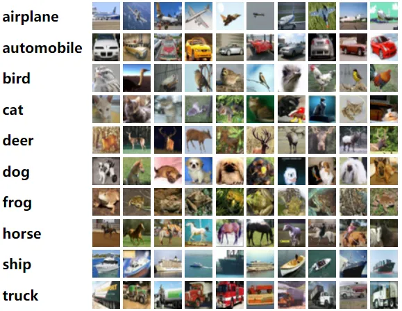
Let’s see what we can get with another standard dataset, Cifar 10. It still does not represent the real-world data since images are relatively small (32x32 pixels), but we add colors (so real dimensions are 32x32x3) and some more complex shapes (cars, animals, …). Here are some examples of what you can find in this dataset:
Here is a code snippet allowing you to visualize Cifar10:
import matplotlib.pyplot as plt
from sklearn.datasets import fetch_openml
from umap import UMAP


# Load MNIST dataset
mnist = fetch_openml('CIFAR_10', version=1, cache=True)
X = mnist.data
y = mnist.target.astype(int)


# Apply UMAP
umap = UMAP(n_components=2)
X_umap = umap.fit_transform(X)


# Plot UMAP output with class colors
plt.scatter(X_umap[:, 0], X_umap[:, 1], c=y, cmap='tab10', s=1)
plt.colorbar()
plt.title('UMAP Visualization of CIFAR10')
plt.show()
The plot will be:
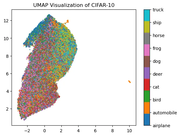
Elements seem to be randomly plotted and no easy data analysis is possible. Why is that happening?
UMAP suffers from what we call the Curse of Dimensionality. In short terms, when dimensionality is rising high then all datapoints are close to each other with regard to metrics. Since UMAP is a metric-based algorithm it fails to correctly map elements.
Pre-trained model for embeddings extraction
To address this problem we have to extract meaningful information from the data into smaller vectors that are called embeddings. To do so we will extract information by using some pre-trained image model. We will use Resnet50 but feel free to experiment with other models! The Resnet model is a relatively big computer vision classification model that you can easily run locally. It is a standard model to use for vision tasks but any other model (variants of EfficientNet, Mobilenet, etc…) will do the work we expect here!
import timm
import torch
from sklearn.datasets import fetch_openml
from torch.utils.data import DataLoader, TensorDataset
import torchvision.transforms as transforms
from tqdm import tqdm


# Load Cifar 10 dataset
cifar10 = fetch_openml('CIFAR_10', version=1, cache=True)
X = cifar10.data
y = cifar10.target.astype(int)


# Create model for Embeddings extraction
resnet50 = timm.create_model('resnet50', pretrained=True)
resnet50_without_last_layer = torch.nn.Sequential(*(list(resnet50.children())[:-1])).to("mps")


# Prepare data for Embeddings Extraction
X_tensor = torch.tensor(X)
y_tensor = torch.tensor(y)


resize_transform = transforms.Compose([
   transforms.ToPILImage(),
   transforms.Resize((224, 224)),
   transforms.ToTensor(),
])


X_resized = torch.stack([resize_transform(x) for x in X_tensor])


dataset = TensorDataset(X_resized, y_tensor)
train_loader = DataLoader(dataset, batch_size=64, shuffle=False)


# Extract Embeddings
embeddings = []
progress_bar = tqdm(total=len(train_loader))


# Iterate through batches
with torch.no_grad():
   for inputs in train_loader:
       inputs = inputs[0].to("mps")
       outputs = resnet50_without_last_layer(inputs)
       embeddings.append(outputs.cpu())
       progress_bar.update(1)


progress_bar.close()
embeddings = torch.cat(embeddings, dim=0)
embeddings = embeddings.tolist()
And when we apply UMAP on those embeddings, we will have the following representation:
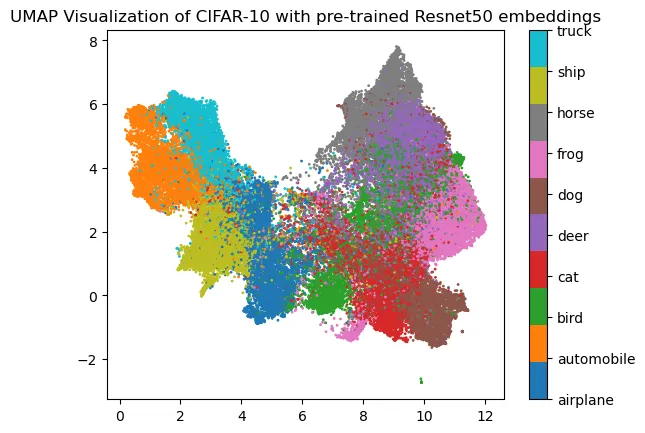
It is already more organized and some analysis may be done. You could ask why some pieces of data are badly plotted. Pretrained vision models may struggle to retrieve meaningful embeddings when presented images are too different from the training set. In our case, we used a model trained on ImageNet, a large image dataset with each image having 469x387 pixels. When presenting our up-scaled 32x32 pixels images it is quite different from what it has already seen.
Fine-tuned model for embeddings extraction
However, it is possible to push a little bit further. Indeed, one can fine-tune the pre-trained model to improve retrieved embeddings. The following representation is obtained from only one epoch training on the Cifar 10 dataset:
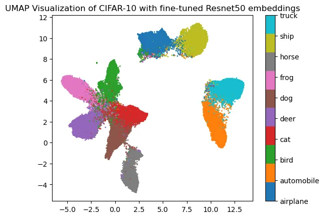
And now we have something more comfortable to work with!
Things to remember for real-world data projection with UMAP
Those first examples were aiming to make a few points:
- To show how powerful for data representation UMAP is
- To provide some tips and guidelines for dealing with real-world data
Examples were done with image datasets, but it is important to remember that UMAP is completely agnostic of what kind of data you are providing! If you manage to get meaningful embeddings of your data, you can use UMAP to verify its quality.
As the final touch, the 2D representation when properly linked to the meaning of each datapoint (ex: its classes) will allow you to properly curate the dataset even if you are not the expert of the business logic! Indeed, you only need to spot badly plotted points. Furthermore, if you filter out some elements you can see the immediate impact on your data in the high dimension. It can be useful, especially for some GenAI projects when you need to retrieve data vectors to populate context based on the distance to the user prompt.
Let’s see what we can do with some data used for a GenAI project.
How to use UMAP for AI Chatbot project
Context about a Chatbot Project
When creating a domain-specific chatbot at some point you will create a text database that you will use as context. How does it work? When Someone is chatting with your bot, its messages will be vectorized then after the similarity search the corresponding context will be retrieved from the database. Then prompt engineering will order the LLM how to assemble the question and the context. Finally, the model response will be generated.
If you’d like more insights about the process feel free to visit Teaching Custom Knowledge to AI Chatbots.
Why is it important to curate the context database?
The similarity search is done by computing the distance between the user’s message embeddings and context embeddings stored in your database. Since context retrieval is done by metric computation, it is important to have elements “far” one from another. Otherwise, the retrieved context may not match the user’s message. As a consequence, the response will not be satisfactory.
Example of GenAI dataset projection
To illustrate how we can use UMAP to improve the context database, we will use the same data as in Teaching Custom Knowledge to AI Chatbots (kindly provided by its author). This database contains 996 entries where each entry is an association between text and LLM generated embeddings.
The main difference between images and text is that for text we have very large pre-trained models that are good for embedding extraction no matter (almost) what text we present to them. Just to compare Resnet50 that we used previously has 25.6 million parameters and GPT-3.5 has 175 billion of them! We can expect then, that embeddings provided by LLM are good enough for UMAP projection.
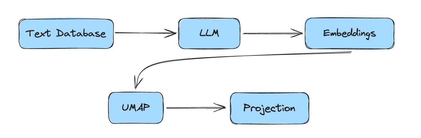
The pipeline for UMAP projection of the text data would be :
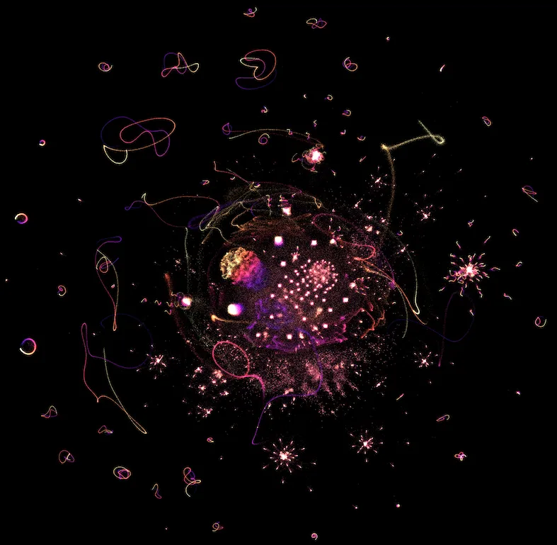
When those embeddings are projected the following representation results:
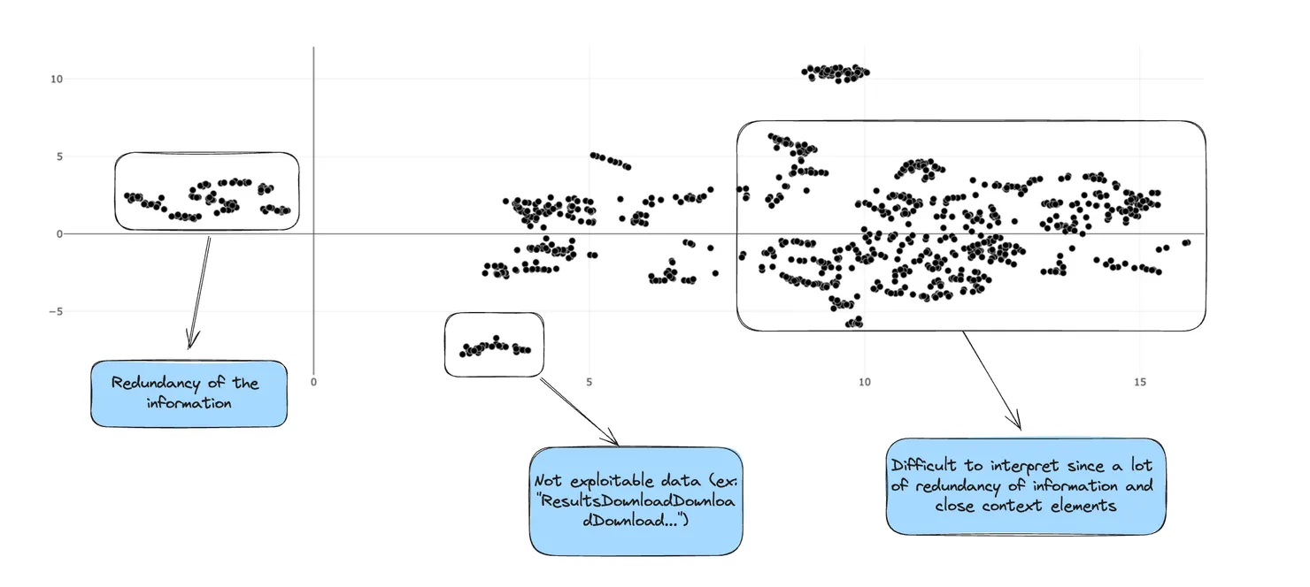
As you can see it is quite difficult to interpret those results. However, it shows that we have a lot of redundancy of information in our dataset. To deal with this issue, we would apply the following filtering:
- For each sentence of the dataset we find the closest sentence with regard to Jaro-Winkler distance
- When two sentences are too similar we filter out one of them, and keep another one
By changing the distance threshold we can keep track of how we are modifying our high-dimensional dataset and choose the best representation for our use case!
After some experiments, we achieve the following representation:
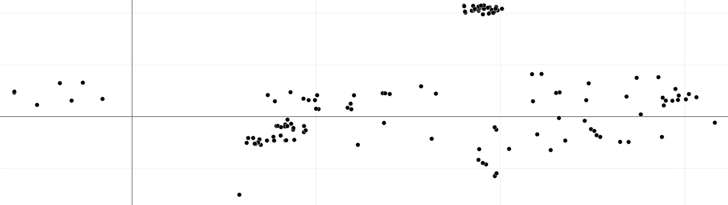
In this new representation with a very simple filter, we got rid of redundant information and still preserved useful pieces of data. By doing so, we divided the size of the dataset by 4!
Furthermore, as said before, context retrieval is better when datapoints are far apart with regard to some metric. With the new visualization, we also improved this aspect of our database.
Conclusion on UMAP utility for dataset curation
In conclusion, UMAP emerges as a valuable asset in the arsenal of tools for data exploration in AI projects. Its ability to efficiently handle large and complex datasets, coupled with intuitive visualization capabilities, makes it an efficient tool for AI practitioners striving for success in their projects. As AI continues to advance, leveraging techniques like UMAP will be crucial in unlocking the full potential of data-driven applications across various domains.